Enhance Early Adoption with Mobile Friendly Themes
At Rietta, we’ve worked on many web application projects. We’re backend programmers and work with different design teams chosen by our clients. These projects tend to be rolled out in phases. Often the first phase is the desktop website with the intention to do a mobile application of some sort later.
But, when the new business' website is announced on Facebook and via an e-mail to the pre-launch mailing list, the majority of the first clicks are from iPhone and Android device users!
Think about this; the tendency is to design for the desktop first, the launch, then improve the website for mobile users. But, mobile users are actually the first visitors (by 60% or more for some demographics).
As a point of proof, consider that in November 2010 visitors to web-based e-mail websites (like Gmail or Yahoo) declined by 6%, but people accessing email with their mobile devices grew by 36%. But that’s just e-mail. In terms of mobile e-commerce, PayPal was seeing up to $10 million in mobile Total Payments Volume a day in June 2011, which was a big increase from the $6 million they reported in March 2011. This trend has continued to accelerate.
The lesson is, one no longer has the luxury of doing the desktop now and the mobile experience later.
Mobile-first design is a new trend in the industry that is designed to improve this situation. The first step is to use a Responsive CSS template as the foundation of the project instead of insisting on a pixel perfect desktop design a separate pixel perfect mobile design.
Only after this step is taken, does it make sense to think about the deeper topics of how to use features of the smartphone, such as dialing a phone number or opening a map for turn-by-turn directions. Or using geo-location features of the phone to drive the user experience for the mobile user of the web application.
Twitter Bootstrap and Zurb Foundation are my two favorites as a backend developer. They look good and provide a good number of options for making a pretty user experience (UX) without the need of creating substantial amounts of custom front-end markup and front-end code.
Wanting to know what designers think, I asked Spencer Norman of Collider Creative
At Collider Creative, we don’t build sites that aren’t “responsive” in some way. I strongly believe that if your website doesn’t work as well or better on mobile devices (of all shapes and sizes) than it does on the desktop, then you are asking a good chunk of your audience to find their content, product, or resources elsewhere. I believe that the “responsive” design push has developed out of a necessity to be able to rapidly deploy websites and apps that not only “work” but look fantastic across a wide variety of resolutions and DPIs. Developments in the CSS spec has given us media queries that allow us to serve specific assets to specific sized screens, and more recently (using the @2x directive) to deliver high-resolution assets to high-DPI screens (retina Macbook Pro, among others).
I think where trouble can and does often occur is when responsive design is cited as a reason not to design. Responsive design can quickly and dangerously become a crutch instead of a support. Responsive design should be seen as more work than designing for a single device. Having the ability to shrink elements on your page based on the viewport of the host device is an incredibly useful and powerful feature. But you still need to design your page or app for every device size! Rarely is just shrinking all of your content and sliding a few blocks over (for grids such as bootstrap, foundation, etc) the full answer to “designing” your website for mobile devices. There are design decisions to be made! Design decisions about which content is most important, what should be above the fold, how does the navigation work on each device, what pictures to load, which sizes to load, how to load them (hint: lazyload), and more. Using a responsive template, grid, or foundation for your site is a place to start, not a place to finish.
There is a movement towards Mobile First Design. Which means that you design the entire website with the mobile user in mind first, and then expand towards the desktop. Frameworks such as 320andUp champion this sort of design pattern. I’m not sure it matters where you start, so long as your end product is designed specifically for mobile users AND desktop users.`
Practicing the idea
We’ve recently completed a theme update for the Atlanta Ruby on Rails Developer website. In this update, we’ve switched it from a fixed-width design to a new responsive design based upon the latest Twitter Bootstrap. I think the results speak for themselves. Consider these screenshots, the first with Google Chrome with a narrow window and the second with the iPhone 5 simulator.
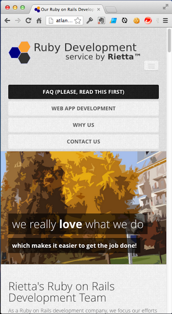
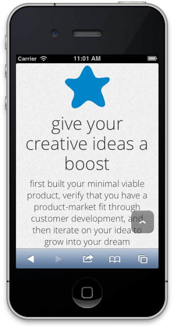
This looks so much better than the old fixed design when reading on the mobile device. I personally use the Samsung Galaxy S3, which has a larger screen than the iPhone 5, and the page is extremely readable without the need for my glasses or squinting!
Our development team is already putting this into practice with an active Ruby on Rails application that will be publicly launched within the coming weeks. In that project, we used the Zurb Foundation 4 framework to support the front-end work. I spend as much time browsing the site for testing using my Android device as I do the web browser on my development laptop.
We have begun plans to rework Rietta’s main corporate website into a responsive design, but in the mean time Atlanta Ruby Developer has already begun that journey.
Concluding remarks
It’s my hope that this article will be an encouragement to you to think about your own website and future web applications. Consider taking a mobile-first approach to design. As Spencer wisely pointed out, it’s not just about using a responsive template that slides sections of the website around. That’s a start, but think carefully about what matters most for your user, especially one who is on the go. Sometimes this is just as simple as focusing on content rather than navigation and branding.